The color of Humility and Holiness
Look in your paint box and you’ll no doubt find Ultramarine Blue, the most widely sold color after white. Artists have adored this blue pigment for millennia. We forget sometimes that paint is simply ground up minerals mixed with a binder. In the case of Ultramarine, this rich pigment has a wonderful history.
Ultramarine is a gorgeous, rich and intense blue used in painting. It showed up in the Renaissance period where it became more notably used. But, it was extremely expensive and used sparingly. No wonder it came to symbolize the rare and ethereal qualities associated with religion, for example, you find it is the color used for the robes of the Virgin Mary.
Historically it was used to suggest humility and holiness.
Pictured here is Sassoferato’s “Virgin in Prayer”
1640 – 1650
Blue from Beyond the Sea
The origins of this royal color are fascinating.
The Renaissance artists and later the Dutch and other masters sought out the pigment when they could. At times it was specified to be used in commissions. But really, it wasn’t as if you could just nip down to the local apothecary and scarf up a huge supply. A rare and beautiful commodity, Ultramarine Blue was made from Lapis Lazuli, a gorgeous semi-precious stone used in jewelry. So, you can tell it was already going to be expensive.
The stone wasn’t sourced locally in Europe. Indeed, its name is derived from the fact that it came from afar. At that time, it was only to be found in Afghanistan. “Ultramarine” comes from the latin ultrāmarīnus meaning “beyond the sea”.
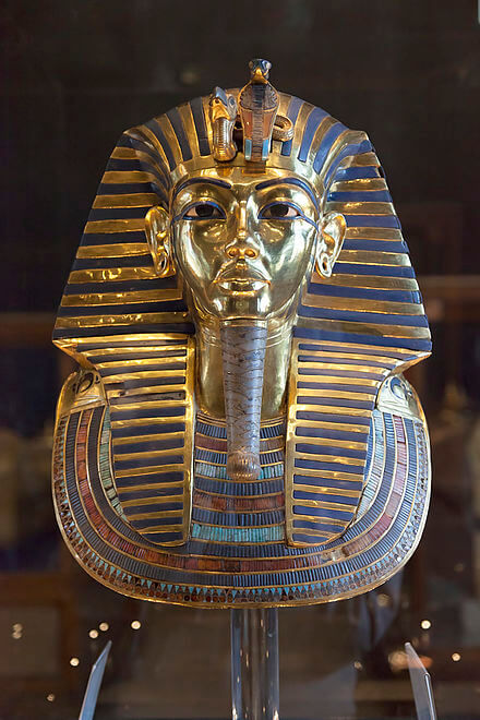
Mined in Afghanistan, the stone was prized for its vibrant blue color. You can find that it was used in art from ancient times. In Afghanistan, you can find it in art from the 6th century. The stone was even discovered in the tomb of Tutankhamun where Lapis Lazuli was used as eyes in his famous death mask.
The mask of Tutankhamun. 1320 B.C.


Pricey Stuff
The cost of this pigment was prohibitive to most. Michelangelo supposedly left “The Entombment” unfinished due to lack of funds to buy this “true blue”. The cloak of the Virgin Mary alone would have required a vast amount of Ultramarine Blue.
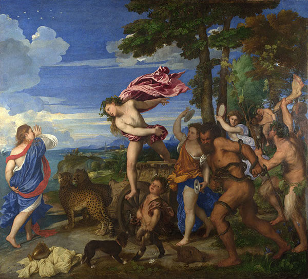
Titian and others of the Renaissance took advantage of the port of Venice where this precious cargo entered Italy. He used large amounts of the color in his epic painting “Bacchus and Ariadne.”
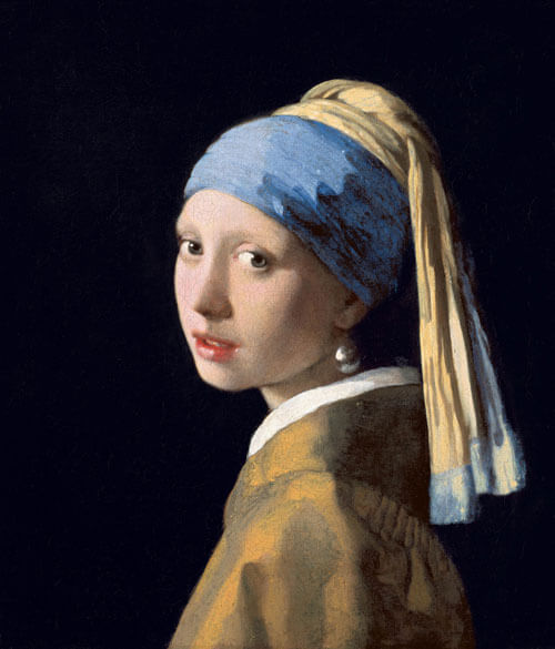
On the other hand, Vermeer overlooked the extravagant price tag and bought it anyway, despite any debt it brought upon the artist. And fortunately for us, the “Girl With the Pearl Earring” was painted donning her headscarf in a beautiful Ultramarine Blue.
“The Girl With the Pearl Earring” by Johannes Vermeer”
1665
What about French Ultramarine?
Well, in an effort to make this pigment more affordable, the French Society for Encouraging National Industry issued a challenge in the early 1800s to see if someone could develop with a synthetic version of the pigment.
Both a German and a Frenchman came up with a type of synthetic ultramarine, creating a bit of a controversy about who was first to create it. But, the prize of 6,000 francs was awarded to the French chemist, Guimet and the color was aptly named French Ultramarine.
How wonderful for us in the world of artists – vraiment magnifique!
Of course, make sure you bring a tube to your next workshop in France!
Titian’s “Bacchus and Ariadne” painted c. 1520

Genuine Lapis is still not readily available. Only a handful of brands carry this rare and expensive color. There are plenty of excellent substitutes and one of the most notable quality brands is Michael Harding.
This is what Michael says about his Lapis Lazuli Oil Paint
“When I first assessed the feel and nature of the pigment it was instantly clear it would have to be milled/dispersed with great care and very gently. Hand grinding was interesting but didn’t quite yield its inner nature as the crisper colour isn’t quite achieved in this way so I elected to use a stone roller mill. The relationship of stone and oil to stone seemed more harmonious; to have used a steel roller machine would have been sacrilegious, to say the least. Its texture is slightly granular almost fluffy in its body, when stroked between fingers you can feel the slight sandy particles are up to 20 microns in size which is of course minute. The synthetic Ultramarine Blue feels more like a gel as if there are no particles as the particles are less than a micron in size. I do see that the making of Lapis was a great challenge and I feel almost nervous yet possessive about making it available.”
To find out more visit MichaelHarding.co.uk
Blogger: Julie Snyder
Julie Snyder is a professional artist and also the programs director of Workshops In France. A native of Scotland, she is a seasoned traveler who splits her time between California and France. You can learn more about her role with Workshops in France here.
Check out more blogs about art workshops, tips and hacks for artists traveling in France and Scotland.
Les Carrières des Lumières Explores Venice 2022
This year at Les Carrières des Lumières, the famous underground quarry is once again transformed into a theater of mind-blowing proportions through the wizardry of technology, showing projected masterworks from Venice as well as the work of Yves Klein in Infinite Blue onto its limestone walls.
George Howard: Photographer at Large in Provence
Occasionally we meet a non-painting partner whose own work inspires the rest of us. The photographs by George Howard are immediately identifiable for their graphic color and beautiful light, the same qualities that artists seek in our work.
Yellow Ochre Lifted from Nature’s Palette
Yellow ochre is a naturally mined pigment used by artists everywhere. One of the must-see villages in Provence is Rousillon, where this multi-hued pigment was mined. You see it as orange, pink, and red on the walls of all houses and the red rock faces for the surrounding hills.


