Hands in the Lascaux Caves of France.
Venetian Red (ferric oxide) has been used in painting, from prehistoric to modern art.
Like many colors used on the palettes of today’s artists, Venetian Red has a fascinating and dramatic backstory. In addition to its place in art, it holds a special place in British history and the American Revolution.
It is not a new pigment, although I wouldn’t say it belongs to all contemporary palettes. This color has been used for thousands of years. Venetian Red is derived from natural earth clay tinted by iron oxide. The deep red pigment required by painters was mined for centuries from a quarry near Venice — hence the name. Interestingly, there still remains a pit outside Venice that is claimed to be the historical source for the finest of this pigment. The name Venetian Red, however, wasn’t coined until the 17th or 18th century.
Since it is found widely in nature, this is color used by many landscape and figure painters, while rejected by others, probably because of its strength. It has a superlative tinting power as it’s semi-opaque. Venetian red is a red pigment with a lower chroma (less bright) than other reds and it has a pinkish undertone, which can be seen when mixing it with white.

The Old Masters
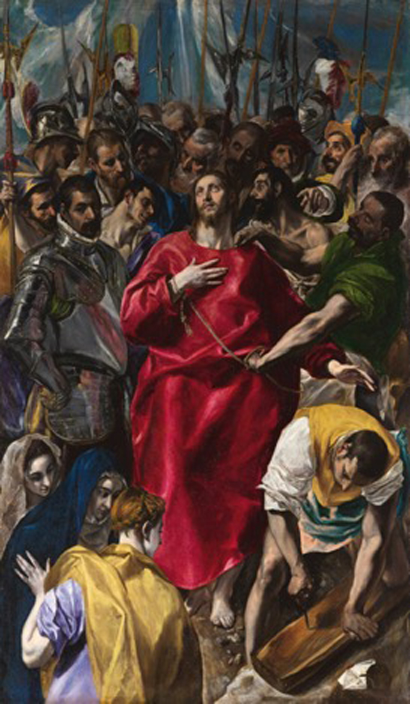
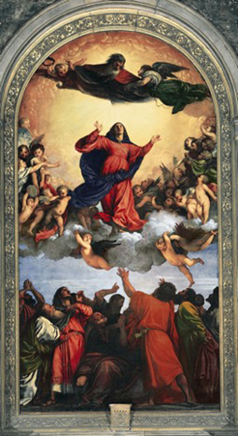
From the Renaissance period, Venetian Red was prominently used in The Disrobing of Christ painted in the 16th century by El Greco, The Assumption of the Virgin by Titian, and many other works of the period. The color is often used in making pinks that that work particularly well for flesh tones.
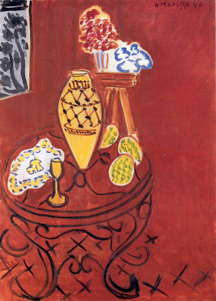
A more modern example can be found in Matisse’s Interior in Venetian Red.
Lascaux Cave Paintings
In art, Venetian Red can be found throughout the ages.
In the ancient world, the color can be found in celebrated Pompeii murals created over 2,000 years ago. Another and perhaps the oldest examples are the 17,000-year-old prehistoric Lascaux cave paintings in France.


Left: Matisse. Interior in Venetian Red.
Right: Lascaux Cave Painting

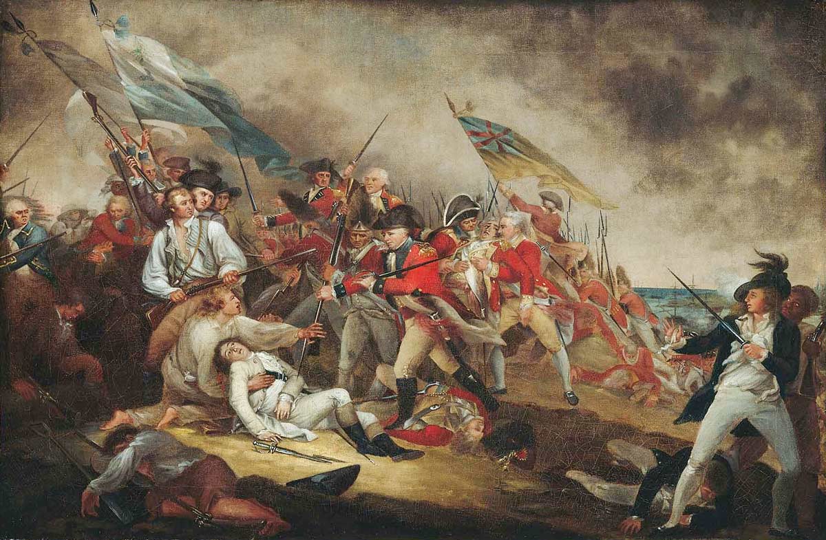
The Death of General Warren at the Battle of Bunker’s Hill, 17 June, 1775 by John Trumbull (American, 1756–1843)
The Redcoats are Coming!
One remarkable fact about this particular hue, was its utilization in dying the standard uniform of the British Army red, beginning in the mid-17th century. What were they thinking? Obviously, not about camouflaging the troops. One of the reasons for it being chosen, and probably the most important, was that it was less expensive at the time than other dyes. The color provided the nickname “Redcoats” throughout the 18th and the 19th centuries—a term taking a central place in American history and literature of the time. Legend has it that Paul Revere, on his famous midnight ride, rode through the New England countryside warning, “The redcoats are coming!”
Not surprisingly, the English changed the color of their battle uniforms to khaki in the 1890s.
Since the 19th century, the color Venetian Red (like many others) has been synthetically produced.
Blogger: Julie Snyder
Julie Snyder is a professional artist and also the programs director of Workshops In France. A native of Scotland, she is a seasoned traveler who splits her time between California and France. You can learn more about her role with Workshops in France here.
Your Artist Getaway Awaits
Check out more blogs about art workshops, tips and hacks for artists traveling in France, Scotland and Italy.
Workshops in France Scholarship 2019
Scholarship Recipient 2019: Kyle Ma Workshops in France is awarding a full scholarship to one of our retreats or workshops in 2019. We look at the artist's work, his or her passion for painting, level of production and what he or she might attain by attending one of...
Tips For Tipping in France
A Tip about Tipping Your guide to tipping in France. Don't Tip Excessively! How much should you tip in France? Here's a tip - over tipping can backfire. The French have high respect for their waiters. Very often they aren't just waiting tables until they get a real...
Pencils. What does H or B or HB mean?
The mighty pencil, is it H or B or HB and what does it mean?
H is from HAUT. It means HIGH. There is a high quantity of binder creating a harder lead with less graphite deposit. The larger the H number, the lighter the stroke. So, if you need the lightest of touch, use the H pencils. They also stay sharper longer…


